








What Is Mobile Optimization?
Mobile optimization is the process of designing, developing, and configuring websites to deliver an exceptional user experience on smartphones, tablets, and other mobile devices. In 2026, mobile optimization is not optional — it is the default lens through which all web development must be viewed.
According to data from StatCounter, mobile devices account for approximately 60% of global web traffic. Google's mobile-first indexing, which became the default for all websites in 2023, means that the mobile version of your site is what Google primarily uses for indexing and ranking — making mobile optimization directly synonymous with SEO success.
The challenge of mobile optimization extends beyond simply making content fit smaller screens. It encompasses performance optimization for cellular networks, touch-friendly interface design, adaptive content strategies, and alignment with mobile-specific search behaviors and contexts. Users on mobile devices have different intent patterns, shorter attention spans, and higher expectations for speed and ease of use.
Mobile-First Indexing and SEO
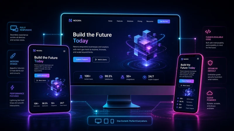
Google's mobile-first indexing fundamentally changed the relationship between mobile optimization and search rankings. Under this system, Google predominantly uses the mobile version of a page's content for indexing and ranking. If your mobile site has less content, fewer internal links, or poorer structured data than your desktop version, your search visibility will suffer across all devices.
Key requirements for mobile-first indexing success include ensuring content parity between mobile and desktop versions, implementing identical structured data and metadata on both versions, maintaining consistent internal linking structures, and serving the same quality images (with appropriate responsive sizing) on mobile as on desktop. Research from Search Engine Land emphasizes that content hidden behind tabs, accordions, or "read more" buttons on mobile is fully indexed, though making key content immediately visible improves user engagement signals.
Mobile SEO also requires attention to mobile-specific ranking factors: page speed on cellular connections, touch element spacing (tap targets should be at least 48×48 pixels with adequate spacing), avoidance of intrusive interstitials, and proper viewport configuration with <meta name="viewport" content="width=device-width, initial-scale=1">.
Responsive Design Architecture
Fluid Layouts and CSS Grid
Modern responsive design leverages CSS Grid and Flexbox for creating fluid, adaptable layouts that respond naturally to any viewport size. Unlike older float-based or framework-grid approaches, CSS Grid enables truly two-dimensional layouts with minmax(), auto-fit, and auto-fill for intrinsic responsiveness that requires minimal media queries.
Container queries, now widely supported across browsers, enable components to respond to their container's size rather than the viewport, creating truly modular and reusable responsive components. This paradigm shift allows developers to build responsive design systems where individual components adapt independently, dramatically reducing the complexity of responsive layouts.
Responsive Typography
Typography on mobile requires careful attention to readability. The clamp() function enables fluid typography that scales smoothly between minimum and maximum sizes: font-size: clamp(1rem, 2.5vw, 1.5rem). Line heights should be slightly more generous on mobile (1.6-1.8 for body text), and optimal line lengths should be maintained at 45-75 characters to prevent eye strain on smaller screens.
Variable fonts reduce the number of font files needed while providing precise weight, width, and style control across different screen sizes and reading contexts. A single variable font file can replace multiple static font files, improving load times on bandwidth-constrained mobile connections.
Touch-First User Experience
Gesture Navigation
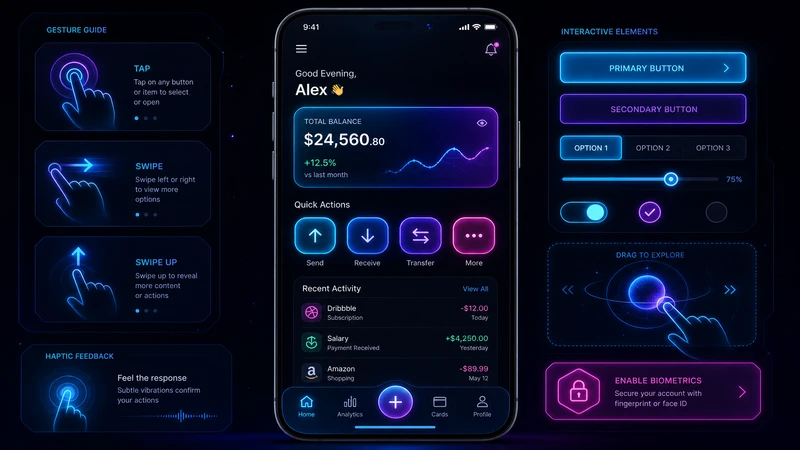
Mobile users interact through touch gestures — taps, swipes, pinches, and long presses. Designing for touch requires generous tap targets (minimum 48×48 CSS pixels as recommended by Android's Material Design guidelines), adequate spacing between interactive elements (at least 8px gaps), and recognition of common gesture patterns.
Swipe-based navigation, pull-to-refresh, and bottom-sheet interfaces have become standard mobile UI patterns. Bottom navigation bars are preferred over hamburger menus for primary navigation, as they are easier to reach with one-handed phone use — a crucial ergonomic consideration as average smartphone screen sizes continue to grow.
Mobile Form Optimization
Forms are often the most challenging aspect of mobile UX. Best practices include using appropriate HTML5 input types (type="email", type="tel", type="number") to trigger the correct mobile keyboard, implementing autofill with proper autocomplete attributes, minimizing the number of form fields, using single-column layouts, and providing real-time inline validation to prevent form submission errors.
Mobile payment integration through Apple Pay, Google Pay, and the Payment Request API can reduce checkout friction dramatically. Research from the Baymard Institute shows that checkout optimization can reduce cart abandonment by up to 35% on mobile devices.
Progressive Web Apps (PWAs)
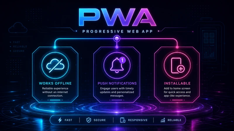
Progressive Web Apps bridge the gap between web and native mobile applications by providing offline functionality, push notifications, home screen installation, and hardware access through modern web APIs. PWAs offer the distribution advantage of the web (no app store gatekeeping) with much of the engagement capability of native apps.
Key PWA technologies include service workers for offline caching and background sync, Web App Manifest for installation metadata, and the Cache API for fine-grained cache control. Modern PWA capabilities extend to file system access, Bluetooth, NFC, and biometric authentication through the Web Authentication API.
Research from Google's PWA case studies shows that companies implementing PWAs see significant improvements: Twitter Lite reduced data consumption by 70%, Pinterest increased engagement time by 40%, and Starbucks' PWA is 99.84% smaller than their native iOS app while delivering similar functionality.
Mobile Performance Optimization
Mobile performance optimization faces unique challenges: cellular network latency, limited device processing power, battery constraints, and variable connection quality. Key strategies include aggressive resource optimization (critical CSS inlining, JavaScript splitting, image compression), network-aware loading patterns that adapt to connection speed using the Network Information API, and reduced JavaScript execution to minimize battery drain and CPU utilization.
Adaptive serving delivers different experiences based on device capabilities and network conditions. The Save-Data client hint allows servers to detect when users have data-saving mode enabled and respond with lighter page versions. Similarly, the Device Memory API and Hardware Concurrency API enable performance-based feature toggling.
Preconnecting to critical origins with <link rel="preconnect">, prefetching likely navigation targets, and implementing service worker precaching strategies ensure that subsequent page loads are nearly instantaneous, even on slow connections.
Mobile Analytics and Testing
Mobile optimization requires device-specific testing and analytics. Real device testing across multiple screen sizes, operating systems (iOS and Android), and browser engines (WebKit and Blink) is essential for catching mobile-specific bugs. Tools like BrowserStack and LambdaTest provide cloud-based access to hundreds of real mobile devices for automated and manual testing.
Mobile analytics should track mobile-specific metrics including viewport distributions, touch interaction patterns, scroll depth, orientation changes, and mobile conversion funnels. Understanding how mobile user behavior differs from desktop behavior enables targeted optimization of the mobile experience.

The Future of Mobile: 2026 and Beyond
The mobile landscape continues to evolve with foldable devices requiring adaptive layouts that respond to screen fold states, 5G enabling richer mobile experiences with lower latency, AI-powered on-device processing for personalization and performance optimization, and augmented reality (AR) capabilities through WebXR creating new mobile interaction paradigms.
Mobile optimization in 2026 is fundamentally about creating experiences that feel native in their responsiveness and intuitiveness while leveraging the web's universal accessibility and zero-installation reach. The businesses that master mobile optimization will capture the majority of digital interactions in an increasingly mobile-first world.